

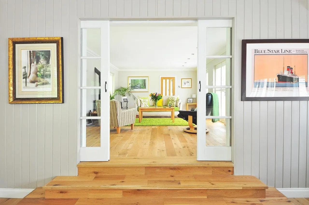
A bare sofa wall, a large canvas and some prints: how to hang art on a wall starts with eye level at the middle of the painting, a 6–8 inch gap above furniture and a stud for anything over 20 pounds.
That quick answer settles placement and weight. Lighting, UV exposure and framing decide how the piece looks and how well it is protected. This guide sorts those decisions by what the reader wants to achieve. The physical fixing steps sit in how to hang pictures on a wall.
Choose your route through the wall
Different walls need different starting points. Pick the job in hand, read that section first and return to the others as the plan firms up.
- One statement piece over a sofa or sideboard. Start with the living room section, then use the height table to set the position.
- A collection of frames. Go to the gallery wall section for spacing and layout, then to frames and mats.
- A heavy or awkward piece. Read the fixings section before anything else, because weight decides the hardware.
- Lighting or protecting art that is already up. Go straight to the lighting and UV sections.
- A hallway, a staircase or something that is not a framed picture. The hallway section and the closing section on posters and textiles cover these.
For most homes the sensible order is placement first, fixings second and light last. Height and spacing decide where the holes go, and the final position of each piece decides where the light has to fall.
Living room: the sofa wall and its furniture
In a living room, hang art in relation to the furniture beneath it rather than in relation to the ceiling. A wall-art hanging guide advises keeping the gap between the top of the furniture and the bottom of the art between 6 and 8 inches. Emily Henderson’s styling advice gives the same 6″–8″ figure for a piece placed above furniture. Two independent sources agreeing on the range makes it a dependable starting point for any sofa, console or sideboard wall.
Furniture design matters here because a sofa or sideboard is a designed object with its own width, height and silhouette. The art above it should read as part of one composition with that piece, not as a separate decision. A sculptural chair or a sideboard with an interesting front already carries visual weight, so a quieter artwork often suits the wall above it. A plain sofa can take a stronger, larger piece.
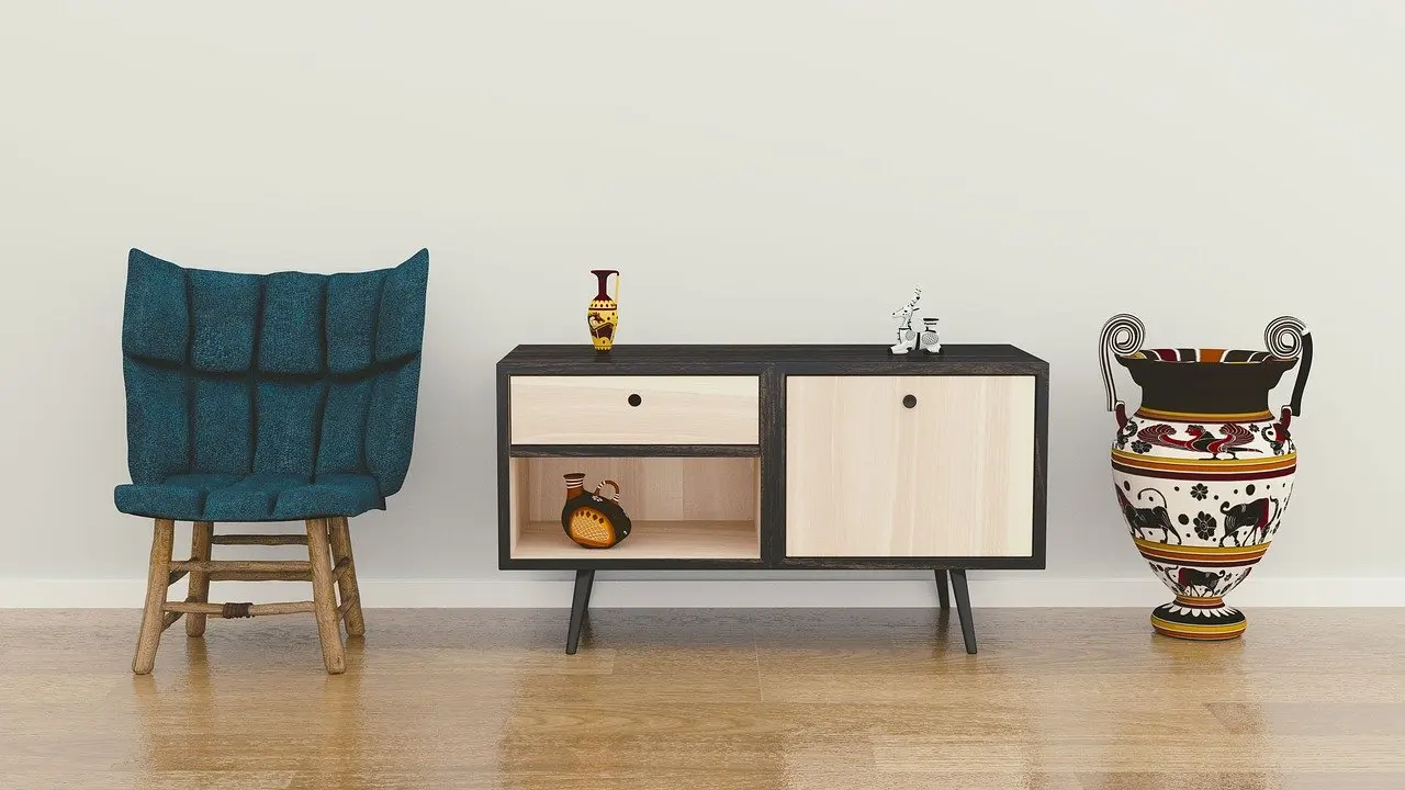
Scale is the other living room decision. A single large canvas gives a sofa wall a clear focal point, while a cluster of smaller frames needs to be planned as one group. Oversized work brings its own handling and weight questions, which how to hang large artwork covers in detail. If the wall is wide and the furniture is low, a group of frames usually fills the space more comfortably than one small piece, and the gallery wall section below explains how to plan it.
Hanging height: eye level and furniture gaps
Hang a painting so the middle of it sits at standing eye level. Wirecutter’s picture-hanging advice states it as eye level at the middle of the painting when you are standing. The rule answers the question of how high paintings should be hung on an open wall, with no furniture to anchor the composition.
When the rules disagree
Eye level and furniture gaps can pull in different directions. A tall piece above a low console may end up with its centre well above eye level if the furniture gap is respected. As a working rule, let the furniture gap decide for pieces that sit above furniture, and let eye level decide for pieces on open wall. A lone piece on an empty wall has nothing else to measure from, so the viewer’s eye line becomes the reference.
| Situation | Rule | Planning use |
|---|---|---|
| Focal painting on open wall | Middle of the painting at standing eye level | Start here when nothing sits below the piece |
| Art above a sofa or sideboard | 6–8 inches between the top of the furniture and the bottom of the art | Measure from the furniture, not the floor, so the pair reads as one unit |
| Tight gallery wall | 2–3 inches between frames | Keeps a group of frames reading as one arrangement |
| Heavy piece | Over 20 pounds anchored into a stud; studs typically 16 inches apart, center to center | Locate studs before fixing the final position |
These figures come from Wirecutter’s picture-hanging advice and a wall-art hanging-height guide.
The rules in the table are starting points rather than fixed laws. Check them against the actual room by holding the piece against the wall, or marking its outline, and stepping back. Readers who want height and spacing worked through for more room types can continue with how high to hang art on wall.
Gallery walls: planning, spacing and layout
A gallery wall works when the group is planned as a single object. The questions to settle are overall shape, the gap between frames and the order of placement, in that sequence.
Treat the group as one piece
Emily Henderson’s guidance is to treat the whole collection as one piece and to orient it in the shape of the wall. On a tall, narrow wall that points towards a vertical cluster. On a wide wall above a sofa it points towards a horizontal spread. Planning the outline first stops a group from drifting into a shape that fights the room. Anyone starting from scratch will find the full process in how to create a gallery wall.
Spacing and consistency
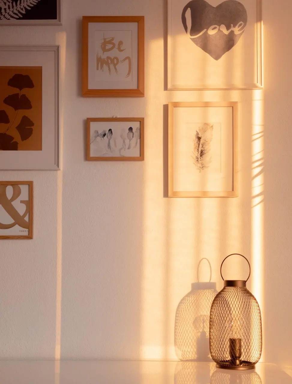
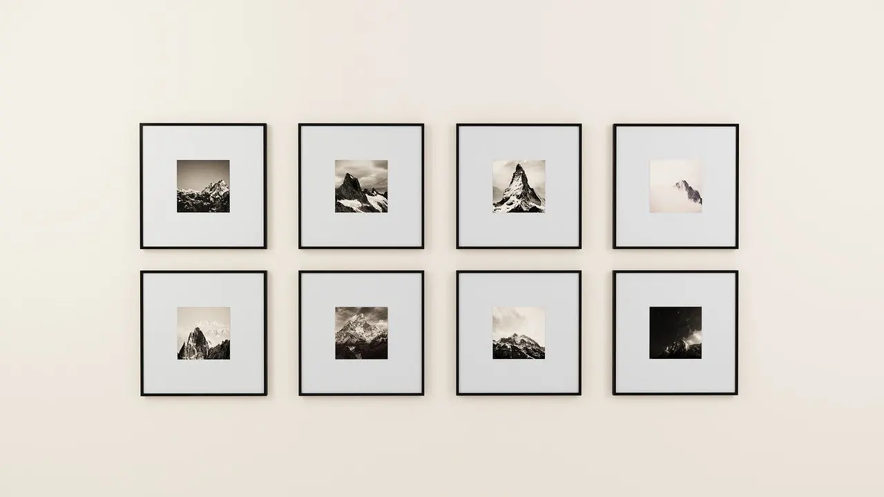
Spacing between frames in a tight gallery wall typically runs 2 to 3 inches. The practical lesson is consistency: choose one gap and hold it across the whole arrangement, because an even gap is what makes mixed frames read as a deliberate group.

Matching frames and mats make that consistency easier and give the cleanest result, as in the grid below. Mixed frame styles suit a looser, more eclectic room, but they depend even more on a steady gap to hold together.
Mock up before you drill
Lay the arrangement out on the floor or pin a paper plan to a board before any wall is marked. Moving paper is free, whereas every wrong nail leaves a hole. Start with the largest or most important piece, fix its position using the height rules above, then build outward. Keep the heaviest frames near studs where the layout allows it.

Frames, mats and glazing
A picture frame finishes the artwork, ties it to the room and sets how much weight the wall must carry. Choose the frame for the work first and the wall second, because a heavy frame changes the fixing decision as well as the look.
For proportion, colour and profile, how to choose a frame for art is the place to start. A canvas follows different logic from a work on paper, so how to frame a canvas painting and how to frame works on paper deal with them separately.
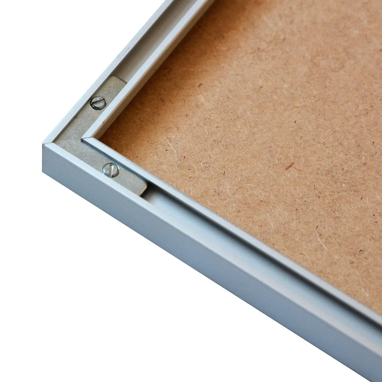
Deeper or more sculptural presentations need a different kind of frame. Readers weighing that option can read what is a floating frame alongside the shadow-box options. Budget decides how many pieces are framed to order, and how much does custom framing cost sets custom work against ready-made frames. A sensible compromise for a large group is to reserve custom framing for the focal pieces and keep the rest consistent and simple.
Glazing is the other framing decision, because it controls both glare and light protection. That choice belongs with the UV guidance further down.
Fixings, weight and hardware
Weight decides the hardware, not the other way round. Wirecutter advises that any piece that weighs more than 20 pounds should be anchored into a stud. It also notes that studs are typically spaced 16 inches apart from center to center, so one stud found with a detector usually points to the next. That affects layout: if a heavy frame has to sit between studs, moving it sideways to meet one is often easier than choosing a weaker fixing.
Picture wire needs a caution. Wirecutter points out that wire can cause artwork to lean out from the wall at an angle. A piece that tilts forward looks careless and catches light badly, so check how the frame sits against the wall after hanging, and consider fixings that hold it flat if it does not.
Decisions before you buy hardware
- Weigh the piece. Frame, glazing and backing all add weight, so weigh the finished frame, not the artwork alone.
- Find the studs. Do this before finalising the arrangement, not after.
- Match the hardware to the frame. Types of picture hanging hardware sets out the options and what each suits.
- Consider a rail where holes are a concern. A picture rail hanging system suits walls where the display changes often or drilling is unwelcome.
Lighting artwork: track lighting and beam choices
Lighting that suits artwork is aimed so it avoids glare, sized to the piece and, where possible, adjustable. A gallery-lighting guide from a hanging-systems supplier recommends a 30-degree angle for minimizing glare in general. Glare is mostly a problem on glazed frames, so the angle matters most for framed works under glass.
Sizing the light to the picture
The same guide gives size rules for the fitting itself. For a portrait picture it suggests a light half the width of the picture. For landscape work it suggests a light between one third and a half of the artwork’s width. These are fitting-size guides, not brightness targets, so they do not tell a reader how strong a lamp should be.
Track lighting and narrow beams
Track lighting brings the gallery approach into a home, since its fittings sit along a line and can be positioned for each piece on a wall. Beam width deserves a check before buying. The guide says narrow light beams are suitable for galleries and other exhibition spaces with high ceilings. A living room with a standard ceiling may suit a different beam, so compare beam spread with ceiling height rather than assuming one fitting suits every room.
Good artwork lighting also lets the owner control light intensity and UV radiation, which the guide lists as aspects that lighting design can manage. That makes adjustability a reason to prefer a flexible track over fixed spotlights when the collection is likely to change.
Protecting art from UV light
UV exposure is the main long-term risk for art on display. Wirecutter warns that UV light will degrade paintings, posters, photographs and other work. Position matters as much as product choice: keep light-sensitive pieces off walls that catch direct sun, and use protective glazing where a bright spot cannot be avoided.
Glazing is the usual defence. The same advice mentions UV-protective glazing that can filter out up to 99% of harmful rays. That is a ceiling for the best products, not a guarantee for every glass, so check the product’s own specification. Museum glass vs regular glass compares the main options. For a broader plan covering windows, rooms and humidity, how to protect art from sunlight goes further.
Lamp choice belongs in the same decision. Because lighting design can control intensity and UV radiation, a display lamp is not automatically harmless to sensitive work. When choosing between fittings, favour ones whose output can be managed over ones that cannot.
Hallways and stairs
Hallways are often a safe place for works that dislike daylight. Wirecutter notes that hallways tend to get less natural light than other parts of a house. That makes them suitable for photographs and paper pieces, as long as the wall is not next to a bright window or glazed door.
Narrow walls limit the size of what fits, so a hallway often suits a single line of similar frames or a small cluster rather than one large canvas. Stair walls change the usual height logic because the viewer’s eye level rises and falls along the climb. How to hang pictures going up stairs deals with that directly.
Posters, textiles and other formats
A poster is a printed design, not a one-off artwork, and it deserves the same care as a painting. It sits in the same list of at-risk media in Wirecutter’s UV warning, so the placement decision is the same: keep it off sun-struck walls or frame it behind protective glazing. A frame also makes an inexpensive print look intentional, and it lets a poster join a gallery wall alongside paintings and photographs.
Textile pieces need a different approach because they are not framed rigid objects. How a tapestry is supported depends on its weight and construction, and how to hang a tapestry on the wall covers the methods. Sculptural or deep pieces call for the floating and shadow-box formats described earlier.
Designed objects can also carry a wall or a corner by themselves. A chair or sculpture with a strong form can balance a hung piece nearby, provided the furniture gap and eye-level rules still decide where the artwork goes.
Frequently asked questions
| Question | Answer |
|---|---|
| How far apart are wall studs? | Studs are typically spaced 16 inches apart from center to center, according to Wirecutter, so finding one often locates the next. |
| Does a poster need the same UV care as a painting? | Yes. The same advice lists posters with paintings and photographs as media that UV light degrades. |
| How wide should the light be for landscape artwork? | A gallery-lighting guide suggests a light between one third and a half of the artwork’s width. |
| Can picture wire make art tilt away from the wall? | It can. Wirecutter says wire can cause artwork to lean out from the wall at an angle, so check how the frame sits once hung. |